YouTube thumbnails matter more than most freelancers realize. Your thumbnail is the first decision point for every potential viewer. They see it in search results, suggested videos and social shares before reading your title. A weak thumbnail means your video never gets a chance to prove its value.
Why thumbnails drive your entire channel performance ?
YouTube’s algorithm uses click-through rate as a primary signal for recommending content. If people scroll past your thumbnail the algorithm assumes your video isn’t compelling. Your content gets buried regardless of quality.
The platform shows that thumbnails and titles work together to trigger clicks. Strong titles paired with generic thumbnails underperform. Amazing thumbnails with weak titles fail too. The combination needs working in harmony.
Most viewers decide whether to click within two seconds of seeing a thumbnail. That split-second judgment happens based on visual clarity, emotional appeal and curiosity trigger. You’re competing against dozens of options in every sidebar and search result page.
Core principles of high-converting thumbnails
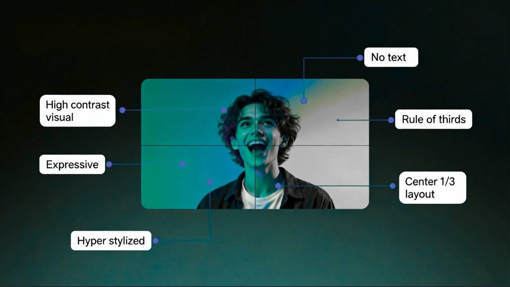
1- Contrast makes elements stand out. Use bold color combinations that pop against YouTube’s white or dark backgrounds. Avoid muddy mid-tones that blend into the interface. Test your thumbnail at small sizes because that’s how most people see it first.
2- Faces increase engagement when used strategically. Close-up shots showing clear emotion outperform distant or neutral expressions. Direct eye contact creates connection. Exaggerated reactions signal the video’s tone and energy level.
3- Text overlays communicate value instantly. Keep it under six words. Use large bold fonts readable on phone screens. The text should complement not duplicate your title. It clarifies what viewers get from watching.
4- Simplicity beats complexity every time. Three visual elements maximum. One focal point that draws the eye immediately. Clean backgrounds that don’t compete for attention. Remove anything that doesn’t serve the core message.
5- Brand consistency builds recognition over time. Use the same color palette, font choices and layout structure across videos. Viewers should identify your content instantly when scrolling. This familiarity increases click-through from existing subscribers.
Comparing thumbnail design tools
#Canva dominates because of its template library and ease of use. Thousands of YouTube-specific layouts give you starting points. Drag-and-drop interface means no design skills required. Built-in dimension presets ensure correct sizing. Free tier handles basic needs with paid plans unlocking fonts and elements.
#Adobe Express offers similar functionality with tighter integration into Adobe’s ecosystem. If you already use Photoshop or Premiere the workflow feels natural. Template quality tends higher but the learning curve is steeper. Better for freelancers who need advanced editing alongside thumbnail creation.
#Photoshop remains the pro choice for complete control. You can create exactly what you envision without template constraints. Masking, layer effects and precise typography give polish that template tools can’t match. Requires significant time investment to master.
#Snappa focuses specifically on social media graphics including YouTube thumbnails. Pre-sized templates and one-click effects speed up production. The platform feels lighter than Canva with fewer features but faster performance. Good for freelancers who batch-create content weekly.
#Thumbly uses algorithms to analyze high-performing thumbnails and suggest improvements. Upload your draft and get feedback on contrast, text size and composition. The data-driven approach takes guesswork out of design decisions. When thumbnails are ready the next step is ensuring they’re paired with optimized metadata. The comprehensive guide on youtube SEO strategies for titles tags and descriptions covers how packaging elements work together to drive discovery.
Design patterns that consistently perform
Side-by-side comparisons work great for before-after content, product reviews or versus-style videos. Split the frame vertically with contrasting images. Add arrows or versus text to make the comparison obvious. Big bold text announcements suit tutorial content and how-to videos. Make the main benefit or outcome huge. Use color blocking behind text for readability. Keep background images subtle so text dominates.
Emotional close-ups excel for storytelling, personal brand content and reaction videos. Fill the frame with a face showing clear emotion. Slight exaggeration reads better at thumbnail size than subtle expressions. Numbered list thumbnails signal structured content. Large numbers in corners or circles tell viewers exactly what they’re getting. Pair with benefit-focused text like “5 Tools” or “3 Mistakes”.
Mystery or curiosity gaps leave something unresolved. Show partial results or unexpected combinations. The thumbnail creates questions the video promises to answer. Be careful not to cross into misleading clickbait territory.
Technical specifications and best practices
YouTube recommends 1280×720 pixels with 16:9 aspect ratio. This size displays correctly across devices. Upload as JPG or PNG under two megabytes. Higher resolution doesn’t improve appearance because YouTube compresses everything.
Design for mobile first. Most YouTube traffic comes from phones. What looks great on desktop might be illegible on small screens. Test your thumbnail at 320 pixels wide before finalizing.
Avoid tiny text or detailed graphics. Fine lines disappear at thumbnail size. Intricate illustrations turn into muddy blobs. When in doubt go bigger and bolder.
Keep important elements in the center 80 percent of the frame. YouTube overlays timestamp badges in bottom-right corners. Platform UI elements can cover edges depending on where the thumbnail appears.
Use high-contrast colors. Red, yellow, white and black create maximum pop. Pastels and earth tones often disappear against YouTube’s interface. Test on both light and dark mode.
Testing and optimization workflow
Create multiple variations for each video. Design three to five options with different focal points or text treatments. Show them to people unfamiliar with your content and ask which they’d click.
Use YouTube’s A/B testing features. The platform lets you test thumbnails after publishing without losing views. Change your thumbnail after 48 hours if initial performance disappoints. For complete video production workflows that include thumbnail strategy check the detailed framework on creating professional videos with modern generator platforms covering every step from concept to publication.
Monitor click-through rate in YouTube Studio. Anything below four percent signals thumbnail problems. Eight percent or higher indicates strong packaging. Compare your CTR against videos with similar view counts in your niche.
Analyze which thumbnails drive the most traffic. YouTube Studio shows each thumbnail’s performance. Identify patterns in your top performers and apply those principles to future designs.
Update thumbnails on older videos. Library content often has weak packaging from when you started. Fresh thumbnails can revive view counts on evergreen material.

Common thumbnail mistakes that kill clicks
Text overload makes thumbnails unreadable. More than six words is too many. If you need a paragraph to explain the value your concept isn’t clear enough.
Low contrast between elements causes everything to blend together. Text needs strong outlines or background blocks to stand out. Avoid placing light text on light images or dark on dark.
Misleading imagery damages trust and watch time. If your thumbnail promises something the video doesn’t deliver viewers leave quickly. This tanks your retention metrics and tells the algorithm your content disappoints.
Inconsistent branding confuses subscribers. They don’t recognize your content when scrolling. Pick a visual system and stick with it for at least 20 videos before changing.
Copying competitor thumbnails without understanding context. What works for an established channel might fail for you. Their audience already knows them. Yours needs different triggers to build initial interest. The complete system for packaging videos including thumbnail psychology is covered in the resource on automating multi-channel video distribution strategies that maximize reach across platforms.
Advanced thumbnail strategies
- Create templates for series content. Lock in consistent placement for episode numbers, branding elements and text zones. Viewers should instantly recognize that videos belong together. Thumbnails perform best as part of a complete video strategy covering generation, editing, SEO and publishing. Explore the full AI video production system to connect every piece.
- Use progression thumbnails for tutorial series. Show visual continuity across episodes with changing numbers or evolving designs. This builds anticipation and encourages binge-watching.
- Add branded elements like logos or color bars. Small consistent touches build recognition without dominating the composition. Place them in the same spot on every thumbnail.
- Test seasonal or topical variations. Holiday themes or current events can boost CTR when relevant. Return to evergreen designs after the moment passes.
- Analyze heatmaps if your platform provides them. Some tools show where viewers’ eyes go first. Optimize based on actual attention patterns rather than assumptions.
Tools for rapid thumbnail production
Canva’s bulk create feature generates multiple thumbnails from one template. Change text or images across dozens of designs simultaneously. Great for channels publishing frequently.
Photoshop actions automate repetitive tasks. Record your thumbnail creation process once then replay it on new content. Cuts production time by half once you build your library.
Browser extensions like TubeBuddy let you preview thumbnails in YouTube’s interface before uploading. See exactly how your design appears in search results and sidebars.
Key takeaways
Thumbnails are the gateway to every video you create. Without strong visual packaging your content stays invisible regardless of quality. Tools like Canva, Photoshop and Thumbly make professional thumbnail design accessible to freelancers without graphic design backgrounds. The key principles are simple: high contrast, clear focal points, minimal text and consistent branding. Test multiple variations, monitor performance data and refine based on what actually drives clicks in your niche. Master this skill and your entire video strategy becomes more effective.

AI tools and digital marketing expert.
Helping freelancers and companies grow with smart AI solutions.

